Features
Everything you need to build content-driven Astro sites.
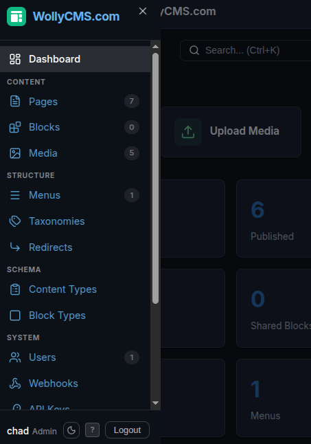
Page Editor
Named regions, composable blocks
Every page is divided into named regions — hero, content, features, sidebar, bottom — that you define per content type. Editors add blocks to each region, reorder them with drag-and-drop, and see exactly how the page is structured. No guessing where content will appear.
- Blocks show their type, title, and position at a glance
- Click + to add blocks from the block library to any region
- Drag handles to reorder blocks within or between regions
- Sidebar shows page info, SEO meta, and accessibility score
class="text-slate-500">// This page has 4 regions with 10 blocks:
class="text-slate-500">//
class="text-slate-500">// HERO (2)
class="text-slate-500">//   1. Hero         — heading, CTA buttons
class="text-slate-500">//   2. Code Terminal — install commands
class="text-slate-500">//
class="text-slate-500">// CONTENT (1)
class="text-slate-500">//   1. Stat Bar      — key metrics
class="text-slate-500">//
class="text-slate-500">// FEATURES (4)
class="text-slate-500">//   1. Feature Grid  — 9 feature cards
class="text-slate-500">//   2. Code Example  — developer experience
class="text-slate-500">//   3. Code Example  — content modeling
class="text-slate-500">//   4. Code Example  — navigation
class="text-slate-500">//
class="text-slate-500">// BOTTOM (2)
class="text-slate-500">//   1. Comparison Table — vs competitors
class="text-slate-500">//   2. CTA Button       — get started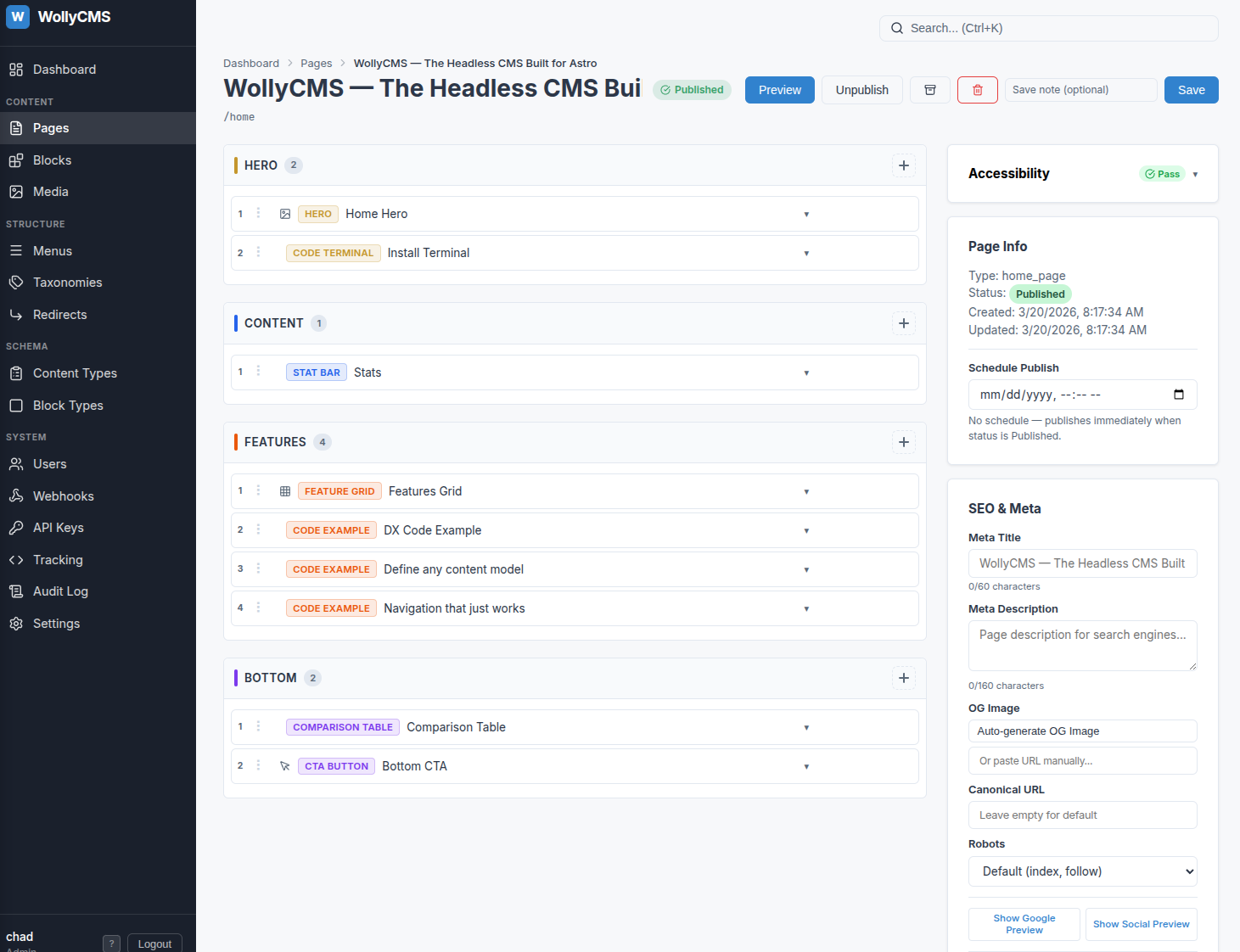
Block Editor
Every field typed, every block editable
Click any block to open its field editor. Text fields, rich text, media uploads, selects, booleans, repeaters — each field type has a purpose-built editor. Block types define their own field schemas, so the editing experience adapts to the content.
- Rich text editor with formatting, links, and media embeds
- Repeater fields for lists of structured data (FAQ items, features, stats)
- Media picker with upload, search, and alt text management
- Shared blocks can be edited once and updated across all pages
class="text-slate-500">// Every block type defines its own field schema
class=class="text-amber-400">"text-sky-400">const heroBlock = {
  name: class="text-amber-400">"Hero",
  slug: class="text-amber-400">"hero",
  fields: [
    { name: class="text-amber-400">"heading",   type: class="text-amber-400">"text",     required: true },
    { name: class="text-amber-400">"subtitle",  type: class="text-amber-400">"text"                     },
    { name: class="text-amber-400">"eyebrow",   type: class="text-amber-400">"text"                     },
    { name: class="text-amber-400">"description", type: class="text-amber-400">"textarea"               },
    { name: class="text-amber-400">"cta_text",  type: class="text-amber-400">"text"                     },
    { name: class="text-amber-400">"cta_url",   type: class="text-amber-400">"url"                      },
    { name: class="text-amber-400">"style",     type: class="text-amber-400">"select",
      options: [class="text-amber-400">"home", class="text-amber-400">"interior"]                        }
  ]
}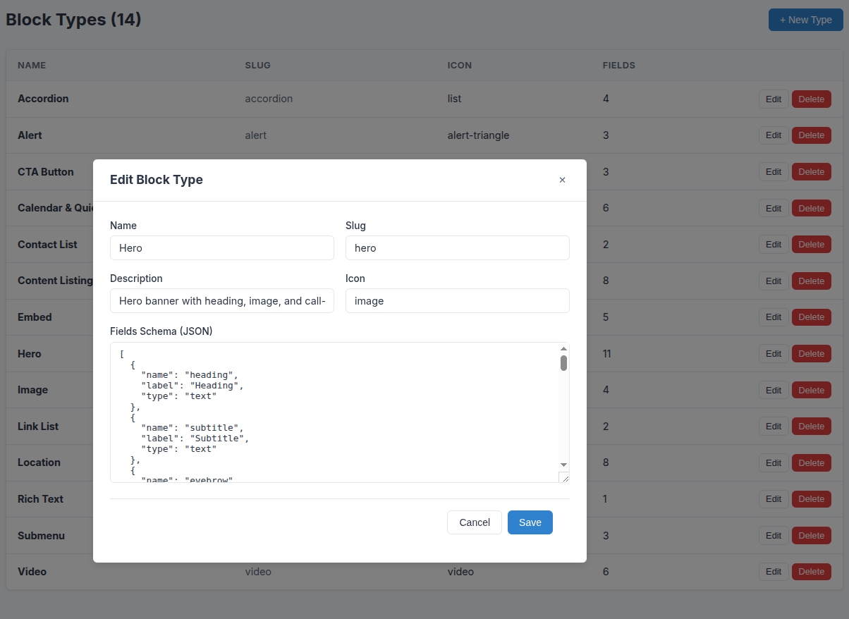
Block Types
Create any block type you need
WollyCMS ships with common block types out of the box — hero, rich text, image, video, accordion, embed, and more. Need something custom? Define a JSON field schema and map it to an Astro component. Use AI coding tools or start from a template to create any block type you can imagine.
- 16 block types included — hero, rich text, image, video, accordion, CTA, and more
- Define custom block types with JSON schemas — use AI tools or pre-built templates to generate them
- Each block type maps to an Astro component via a simple export
- Field types: text, rich text, number, boolean, date, select, media, URL, repeater
class="text-slate-500">// Map each CMS block type to an Astro component
class="text-slate-500">// The class=class="text-amber-400">"text-sky-400">export name matches the block type slug

class=class="text-amber-400">"text-sky-400">export class="text-slate-300">{ default as hero } class=class="text-amber-400">"text-sky-400">from class="text-amber-400">"../blocks/Hero.astro";
class=class="text-amber-400">"text-sky-400">export class="text-slate-300">{ default as rich_text } class=class="text-amber-400">"text-sky-400">from class="text-amber-400">"../blocks/RichText.astro";
class=class="text-amber-400">"text-sky-400">export class="text-slate-300">{ default as image } class=class="text-amber-400">"text-sky-400">from class="text-amber-400">"../blocks/ImageBlock.astro";
class=class="text-amber-400">"text-sky-400">export class="text-slate-300">{ default as accordion } class=class="text-amber-400">"text-sky-400">from class="text-amber-400">"../blocks/Accordion.astro";
class=class="text-amber-400">"text-sky-400">export class="text-slate-300">{ default as code_terminal } class=class="text-amber-400">"text-sky-400">from class="text-amber-400">"../blocks/CodeTerminal.astro";
class=class="text-amber-400">"text-sky-400">export class="text-slate-300">{ default as feature_grid } class=class="text-amber-400">"text-sky-400">from class="text-amber-400">"../blocks/FeatureGrid.astro";
class=class="text-amber-400">"text-sky-400">export class="text-slate-300">{ default as stat_bar } class=class="text-amber-400">"text-sky-400">from class="text-amber-400">"../blocks/StatBar.astro";
class="text-slate-500">// Add your own custom block types here
class=class="text-amber-400">"text-sky-400">export class="text-slate-300">{ default as pricing_table } class=class="text-amber-400">"text-sky-400">from class="text-amber-400">"../blocks/PricingTable.astro";
class=class="text-amber-400">"text-sky-400">export class="text-slate-300">{ default as testimonial } class=class="text-amber-400">"text-sky-400">from class="text-amber-400">"../blocks/Testimonial.astro";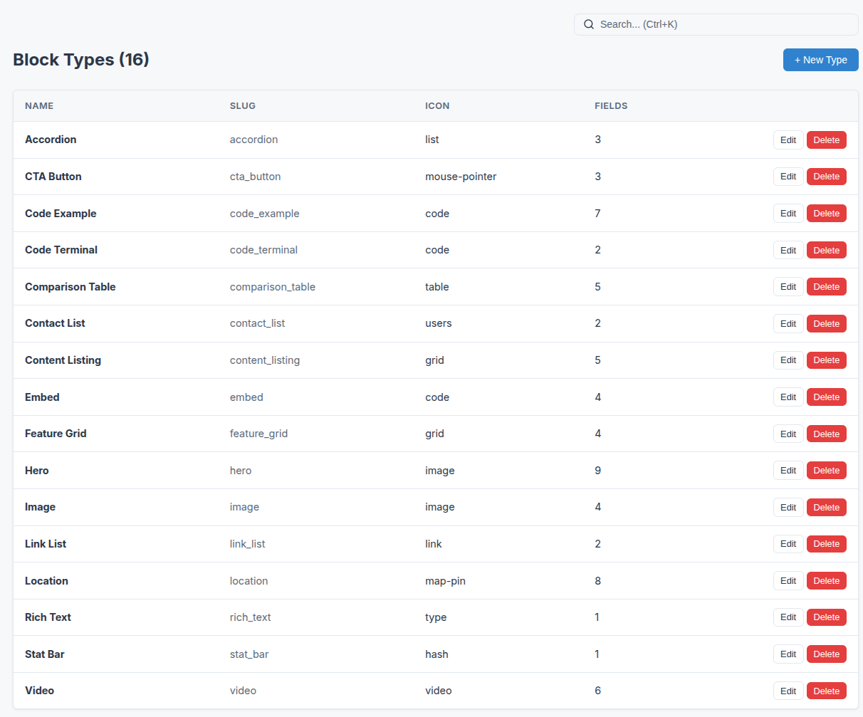
Menu Editor
Navigation with real depth
Create unlimited independent menus — main nav, footer, sidebar, mobile. Each supports deep nesting with parent/child relationships, container items for mega-menu dropdowns, and drag-and-drop reordering. Your Astro layout fetches menus by name and renders them however you want.
- Unlimited menus, each with a unique slug for fetching
- Deep nesting — no arbitrary depth limits
- Container items group children without linking anywhere
- Active state detection and breadcrumb helpers in @wollycms/astro
class="text-slate-500">---
class=class="text-amber-400">"text-sky-400">const menu = class=class="text-amber-400">"text-sky-400">await getWolly().menus.get(class="text-amber-400">"main");
class=class="text-amber-400">"text-sky-400">const footer = class=class="text-amber-400">"text-sky-400">await getWolly().menus.get(class="text-amber-400">"footer");
class="text-slate-500">---

<nav>
  class="text-slate-300">{menu.items.map((item) => (
    <a href={item.url}>
      class="text-slate-300">{item.title}
      {item.children?.length > 0 && (
        <ul class=class="text-amber-400">"dropdown">
          {item.children.map((c) => (
            <li><a href={c.url}>class="text-slate-300">{c.title}</a></li>
          ))}
        </ul>
      )}
    </a>
  ))}
</nav>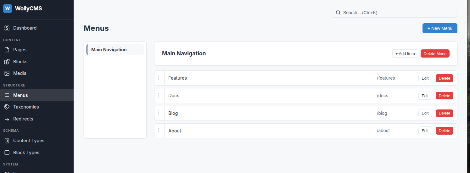
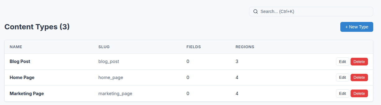
Content Types
Define any page type your site needs
Blog posts, landing pages, product pages, case studies — create content types with custom fields and region definitions. Each type controls what fields editors see and which block types are allowed in each region. Your content model adapts to your site, not the other way around.
- Custom fields per type — text, date, taxonomy, media, repeater
- Named regions with block type restrictions per region
- Taxonomy system with vocabularies, terms, and hierarchies
- Full TypeScript types in the API responses
class="text-slate-500">// GET /api/content/pages?type=blog_post
{
  class="text-amber-400">"data": [
    {
      class="text-amber-400">"type": class="text-amber-400">"blog_post",
      class="text-amber-400">"title": class="text-amber-400">"Building with WollyCMS",
      class="text-amber-400">"slug": class="text-amber-400">"building-with-wollycms",
      class="text-amber-400">"fields": {
        class="text-amber-400">"author": class="text-amber-400">"Chad",
        class="text-amber-400">"date": class="text-amber-400">"2026-03-20",
        class="text-amber-400">"featured": true
      },
      class="text-amber-400">"regions": {
        class="text-amber-400">"hero": [{ class="text-amber-400">"block_type": class="text-amber-400">"hero", ... }],
        class="text-amber-400">"content": [{ class="text-amber-400">"block_type": class="text-amber-400">"rich_text", ... }]
      }
    }
  ]
}
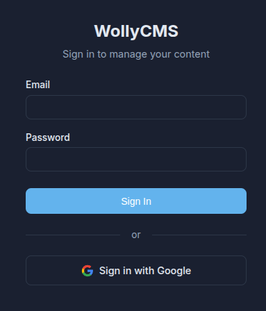
Authentication
OAuth + Two-Factor Security
Sign in with Google, GitHub, or Microsoft. TOTP two-factor authentication with recovery codes and trusted devices. Multi-provider OAuth framework lets you add custom providers with a single config object.
class="text-slate-500">// Built-in providers: Google, GitHub, Microsoft
class="text-slate-500">// Add your own with a config object:

class=class="text-amber-400">"text-sky-400">export class=class="text-amber-400">"text-sky-400">const myProvider: OAuthProvider = {
  name: class="text-amber-400">"okta",
  authUrl: class="text-amber-400">"https:class="text-slate-500">//auth.example.com/authorize",
  tokenUrl: class="text-amber-400">"https:class="text-slate-500">//auth.example.com/token",
  userInfoUrl: class="text-amber-400">"https:class="text-slate-500">//api.example.com/userinfo",
  scope: class="text-amber-400">"openid email profile",
  clientId: () => env.OKTA_CLIENT_ID,
  clientSecret: () => env.OKTA_CLIENT_SECRET,
  redirectUri: () => env.OKTA_REDIRECT_URI,
};
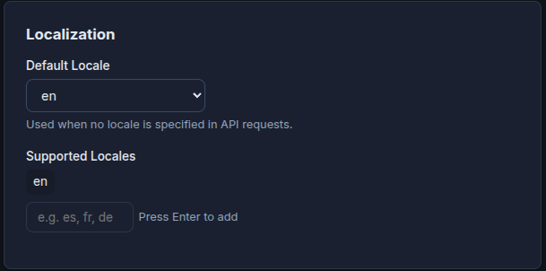
Localization
Multi-language content made simple
Page-level translations linked by translation groups. Each locale gets its own page with its own content, connected to sibling translations. The content API filters by locale and returns translation links for language switchers.
class="text-slate-500">// Fetch Spanish version of a page
GET /api/content/pages/about?locale=es

class="text-slate-500">// Response includes translations:
{
  class="text-amber-400">"locale": class="text-amber-400">"es",
  class="text-amber-400">"translations": [
    { class="text-amber-400">"locale": class="text-amber-400">"en", class="text-amber-400">"slug": class="text-amber-400">"about", class="text-amber-400">"title": class="text-amber-400">"About Us" }
  ]
}
AI Integration
AI-powered content assistance
Connect any AI provider — OpenAI, Anthropic, Google Gemini, or run local models with Ollama. Generate meta descriptions, suggest alt text for images, and draft content. All from a single settings page.
class="text-slate-500">// Configure in Settings > AI Provider
class="text-slate-500">// Choose: OpenAI, Anthropic, Gemini, Ollama, Custom

class="text-slate-500">// Then use the AI endpoints:
POST /api/admin/ai/suggest-meta
POST /api/admin/ai/suggest-alt
POST /api/admin/ai/complete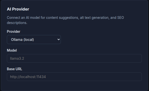
Admin Experience
Dark mode, mobile-ready, keyboard-driven
The admin UI supports light, dark, and system themes. Mobile-responsive with a hamburger sidebar on phones. Loading skeletons, keyboard shortcuts, Cmd+K search, and a content tree view for navigating large sites.
class="text-slate-500">// Theme persists in localStorage
class="text-slate-500">// No flash on page load (inline script)
class="text-slate-500">// OS preference detection for system mode

class="text-slate-500">// Keyboard shortcuts:
class="text-slate-500">// Ctrl+K  — Global search
class="text-slate-500">// Ctrl+S  — Save page
class="text-slate-500">// ?       — Show shortcuts